There are always design rules that stand the test of time
Whether they were taught to us by our mothers in childhood or taught by our favorite professors and mentors, we always hold some design rules to be true. Well, this year we’re throwing out the rule book (somewhat) and daring to challenge the norms.
The first step to breaking design rules is to fully understand them. Once you have an understanding of traditional design standards, you can learn how and when it is appropriate to break them. Here are three rules that I’m challenging this year.
1. Dark-colored walls, especially dark ceilings, make rooms feel claustrophobic.
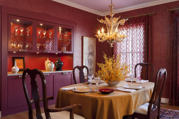
The most important thing to keep in mind when selecting a color is to consider how the room will be used. If it’s a cozy den or an elegant dining room, dark walls add the perfect touch of warmth and intimacy. As seen in this beautiful Beverly, Massachusetts dining room that Elizabeth designed, dark colors set a wonderful mood in the right space–don’t be afraid to make a statement!
2. Matching is a must.
To achieve an interesting, layered and organic look, try mixing different patterns. Keep the color families consistent but let different prints stand on their own. Too much matching makes for a room that looks staged and sometimes too perfect to be truly comfortable.
3. Woodwork should be white.
While white woodwork will always be classic and elegant, an unexpected color choice is a fun and different addition to a color scheme. It can also be a great way to tie different spaces together for a colorful and well thought-out flow.

Leave a Reply