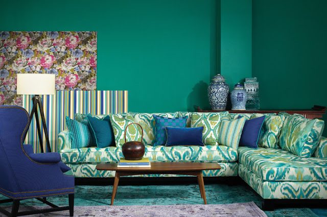
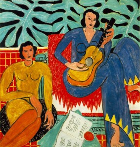
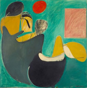
This spring Robert Allen debuted a new upholstery fabric Color Library Collection called Pigment for Spring/Summer 2013. This collection features bright, bold, vibrant colors and artistic color palettes. The collection is centered around three color concepts – tone on tone, multi-color brights and popular color pairings with a twist. The entire collection was inspired by pure pigments, such as those used by artists like de Kooning, Van Gogh and Matisse, and incorporates highly saturated shades of turquoise, cobalt, fuchsia, and viridian.
“The cornerstone of the Robert Allen brand is color,” notes CEO Philip Kowalczyk. “This collection marks the 30th year of Color Library introductions, showcasing our long-term dedication to being at the forefront of color.”
Viridian was the forerunner of the collection, as Pantone announced the ‘Color of the Year 2013’ was Emerald…a color strikingly similar to the color viridian that Robert Allen’s VP of Design, Christy Almond had identified as important for 2013 months earlier. “Viridian is a punchy green that’s perfectly in tune with the current bold and bright design aesthetic you find in cutting-edge interiors and on today’s runways”, said Almond.
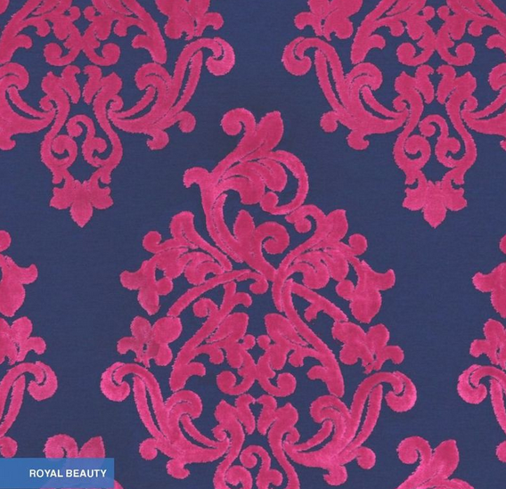
I happen to be a big fan of the cobalt collection. Royal Beauty is a best-selling Robert Allen design now available for the first time in the brightly saturated shades of the Spring 2013 Color Library. Bold coloration like you see here use the popular color pairings of cobalt blue and fuchsia to bring a modern twist to this classic design.
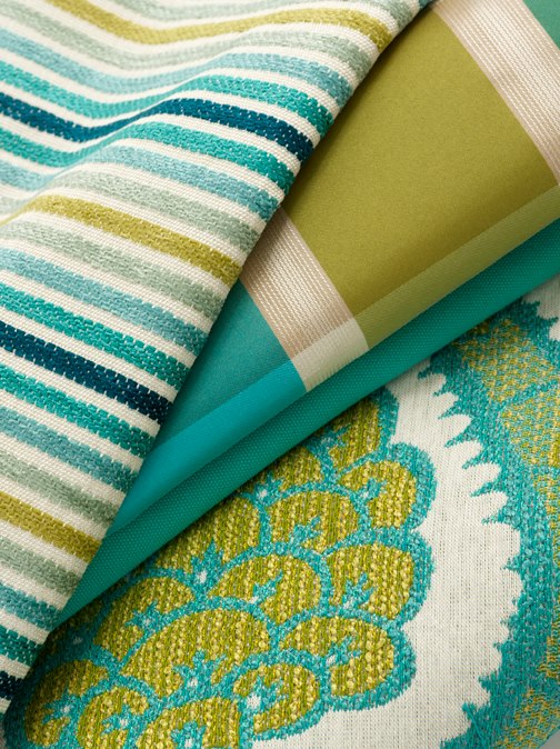
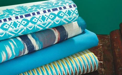
And not to be left behind, Turquoise will be a stand out summer color, reminiscent of beaches and oceans and waves with it’s calming effect from the green-cast blue.
Which colors in the Robert Allen Spring 2013 collection are your favorites?
Leave a Reply